Your website homepage is your brand’s digital front door. It’s the first impression most visitors will have of your business — and like any good first impression, it needs to be intentional, informative, and inviting. Whether you’re a startup or a growing small business, designing your website homepage for better conversions can make the difference between a bounce and a buyer.
n this guide, we’ll cover everything you should include on your homepage to make it effective, persuasive, and optimized for results — so your website not only looks good but performs like a conversion machine.
1. Value Proposition: Key to a Website Homepage for Better Conversions
Your homepage should immediately communicate what your business offers and why it’s valuable. This is your value proposition — ideally visible within the first few seconds of landing.
Where it appears: Top of the homepage, typically as a headline and subheadline.
Tips:
Keep it concise and focused on benefits, not just features. Instead of listing what your product or service does, highlight how it helps your ideal customer. Focus on the transformation or solution it offers. For example, rather than saying “Affordable web design,” say “Professional websites that boost your online presence without breaking the bank.”
Use active, benefit-driven language. Your copy should be dynamic and outcome-focused. Phrases like “Grow your audience,” “Save time with automation,” or “Launch faster” communicate energy and clarity. This helps engage visitors emotionally and logically.
Avoid jargon; write like you’re talking to your ideal customer. Don’t use technical terms or buzzwords that only insiders understand. Think about how your target audience speaks and frame your value proposition in their language. Keep it simple, direct, and human.
👉 For example, at Webto.in, we use: “Smart Websites for Small Businesses” to instantly set the tone.
External inspiration: See top value prop examples on Copyhackers.
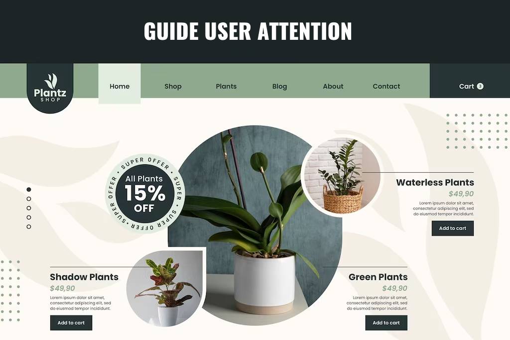
2. Visual Hierarchy Tips for a Website Homepage That Converts
A well-structured homepage isn’t just about aesthetics — it should guide the user’s attention naturally.
Key layout elements:
Hero section (headline, subheadline, CTA): This is your first impression area. Use bold text, clear messaging, and a striking CTA to immediately draw visitors in and guide them toward action. Keep visuals clean and aligned with your brand.
Service highlights or key features: Right below the hero section, highlight your main offerings. Use visual blocks or cards to make these scannable. Each highlight should serve as a doorway into deeper pages and provide instant value recognition.
Social proof/testimonials: Use this section to build trust. Whether it’s a carousel of client quotes or a strip of logos from brands you’ve worked with, this reinforces credibility and keeps visitors engaged.
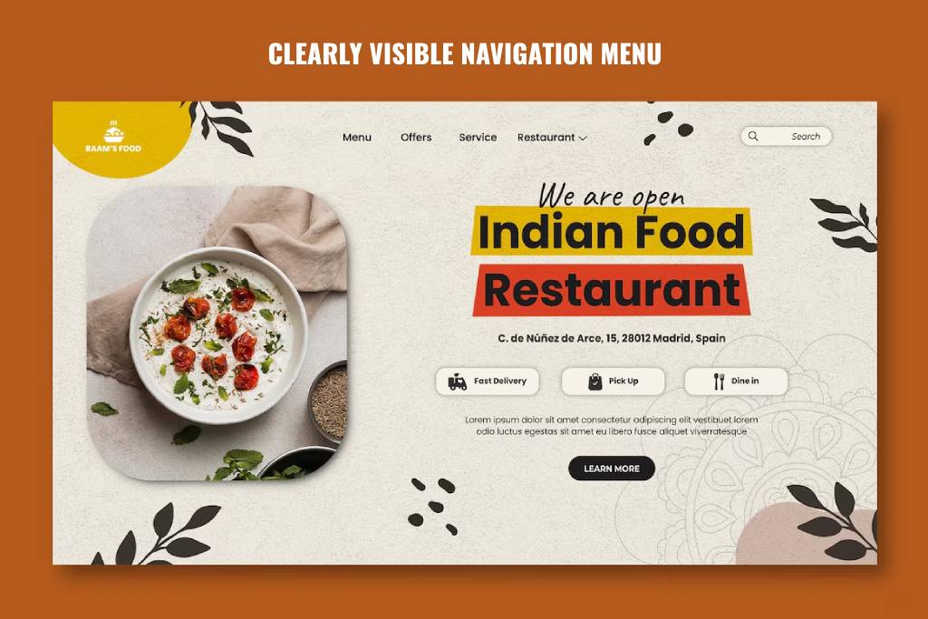
Navigation bar that’s easy to scan: A clutter-free top menu with clear labels helps users find what they need fast. Stick to common terms like “Services,” “Portfolio,” “Contact,” and avoid overloading the nav with too many options.
Clean use of whitespace: Let your content breathe. Generous spacing between sections improves readability, creates focus, and enhances the overall user experience — all of which contribute to higher conversion potential.
Use layout principles like the Z-pattern or F-pattern to lead the eyes from the top headline to your CTA.
Tool to visualize structure:GlooMaps (free visual sitemap builder)
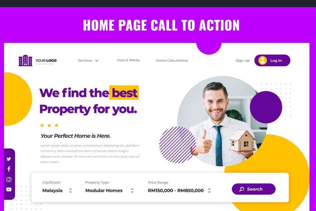
3. Placing CTAs Strategically on Your Website Homepage for Better Conversions
The top of your homepage — often referred to as “above the fold” — is prime digital real estate. This is what users see before they scroll, and it’s your chance to immediately guide them toward taking action. For a website homepage for better conversions, this section should never be passive. It must feature a bold, clear, and relevant call-to-action (CTA) that shows users their next step.
The CTA can be anything from encouraging users to explore your services to nudging them to schedule a consultation — what matters is that it supports your main business goal and appears early in the user journey.
Examples:
“Get a Free Quote”
“View Our Services”
“Schedule a Consultation”
Make sure your CTA:
Use strong, action-oriented verbs. Words like “Start,” “Book,” “Download,” and “Explore” create a sense of momentum and urgency.
Make them visually distinct. Use buttons that contrast with your background but stay within your brand palette. Size and placement should make them unmissable.
Align the CTA with your main business goal. Whether it’s lead generation, product signups, or booking a service, your CTA should push that goal forward.
Repeat CTAs throughout the homepage. Place them not just at the top, but also after key sections — like testimonials, service highlights, or product features.
At Webto.in, our homepage CTA takes you directly to our Contact Page for quotes and consultations.
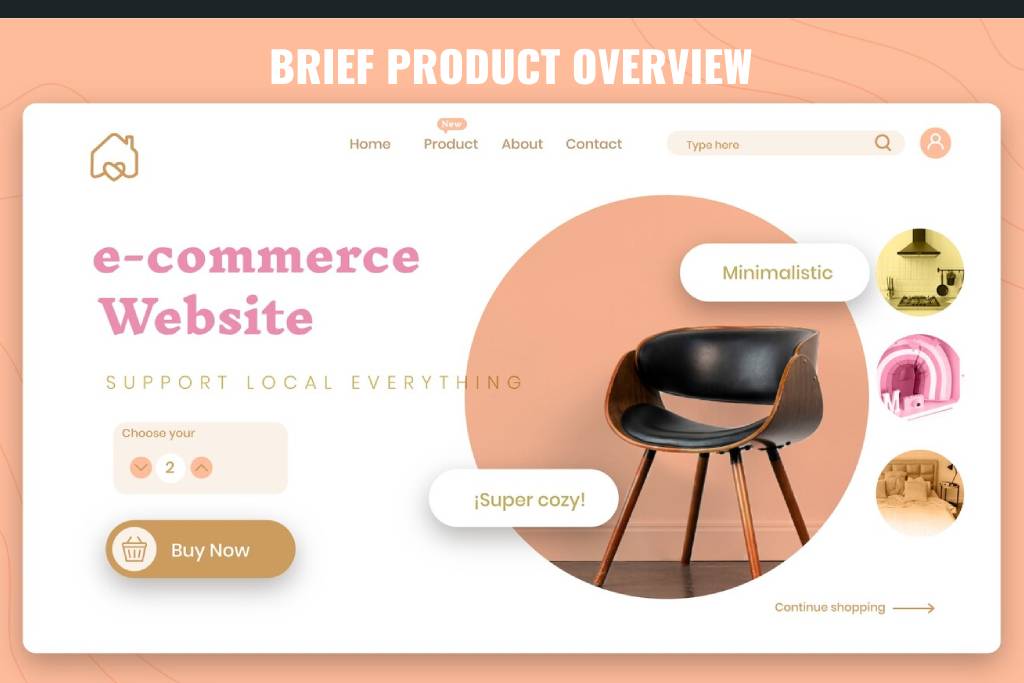
4. Brief Overview of Services or Products
Give visitors a quick snapshot of what you offer — without overwhelming them with too many details. Your homepage should serve as an introduction, not a catalog. A well-done summary section gives just enough information to spark curiosity and get people clicking deeper.
Here’s how to present your services effectively for better conversions:
Use icons or visuals for each offering. Visual cues help users quickly scan and identify areas of interest. Whether it’s website design, SEO, or branding — pair each with a recognizable icon or image.
Add short blurbs (2–3 lines) for each service. Focus on what problem it solves and why it matters. This keeps the homepage concise while still being informative.
Link to detailed internal pages. Turn each service title or button into an internal link that leads to its full page. This improves user experience and SEO by building internal link authority.
Arrange in rows or cards. Use a grid layout to make your services section feel organized and visually appealing.
For example, on Webto.in, we feature icons and short text for Web Design, Maintenance, Hosting, and SEO — each linking to its dedicated page.
Pro tip: Use schema markup on your services section to help search engines understand your offerings better. Learn how at Google’s Structured Data Help.
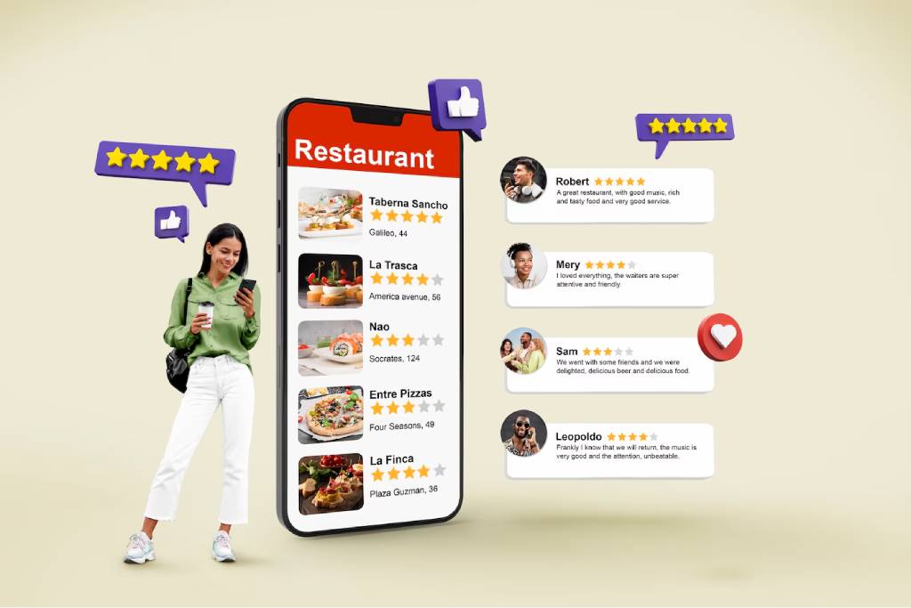
5. Social Proof and Testimonials
When it comes to building trust, nothing beats the impact of real customer experiences. Social proof, such as testimonials and client logos, helps to validate your claims and assures visitors that others have had positive experiences with your business. When placed strategically on your website homepage for better conversions, social proof can quickly turn a hesitant visitor into a paying customer by establishing credibility and fostering trust. Whether it’s through a quote from a satisfied customer or a collection of recognizable logos, social proof works as powerful, user-generated content that supports your brand’s reputation.
Why Social Proof Matters for Your Website Homepage for Better Conversions?
By featuring authentic testimonials or customer logos, you show potential buyers that your business isn’t just trustworthy but also respected by others. These social proof elements become a significant part of the decision-making process, particularly for visitors who are unfamiliar with your brand or hesitant to make a purchase.
How to do it right:
Keep Testimonials Short and Specific: In order for testimonials to be effective, they need to be brief yet compelling. A well-crafted testimonial addresses the pain points your target customer faces, how your product or service helped solve that problem, and the tangible benefits they experienced. For example, “Thanks to Webto’s custom website design, we increased our sales by 30% within the first month” is far more effective than a vague “Great service!” This adds specific value and drives the point home for your website homepage for better conversions.
Use Names, Photos, or Logos If Possible: Authenticity goes a long way in making testimonials feel genuine. Adding names, photos, or logos (for B2B websites) helps establish credibility and shows that real people stand behind your business. It also humanizes your testimonials, which is key in fostering a deeper connection with visitors.
Consider Using a Scrolling Slider for Multiple Reviews: To maximize the impact of your social proof, use a dynamic layout, such as a scrolling testimonial slider. This lets you showcase multiple testimonials without overwhelming the user with too much information at once. By allowing visitors to scroll through reviews, you provide variety and ensure that there’s always a relevant testimonial to connect with any new visitor.
Best Tools to Collect and Display Reviews:
Senja.io: Collect customer testimonials effortlessly and display them beautifully on your website homepage for better conversions.
Trustpilot: A popular platform for businesses of all sizes to gather user reviews and integrate them directly into your homepage for an added layer of trust.
An intuitive and simple navigation system is a critical component of any website homepage for better conversions. Visitors don’t want to waste time hunting for information; they expect to find what they need quickly and easily. If they can’t navigate your site smoothly, they’ll leave — and that’s a missed opportunity. By keeping your navigation menu clear, concise, and user-friendly, you create an effortless browsing experience that encourages visitors to explore your site further and ultimately take action.
Why Simple Navigation Is Key for Your Website Homepage for Better Conversions
A well-organized and simple navigation bar helps users find what they’re looking for with minimal effort. By reducing the cognitive load, you keep users focused on their goals (whether that’s making a purchase, learning about your services, or reaching out to you), which directly impacts your conversion rates. When your navigation is easy to use, visitors are more likely to stay longer, browse more pages, and convert.
Key Elements of an Intuitive Navigation Menu:
Stick to 5-7 Top-Level Links: Overloading your navigation menu with too many options can overwhelm users and detract from your website homepage for better conversions. Keep it streamlined and focused on the most important pages, such as:
Home
About Us
Services
Portfolio or Case Studies
Blog
Contact
By sticking to a limited number of essential links, you give users a clear, guided path through your website. This simplicity reduces decision fatigue, making it more likely that they’ll take the desired action, whether it’s filling out a contact form or making a purchase.
Bonus Tip – Use Sticky Headers: A sticky header ensures that your navigation bar is always visible, even as users scroll down the page. This is particularly helpful for longer pages where users may need to jump between sections quickly. A sticky header keeps the navigation options accessible, improving the user experience and making it easier for visitors to find what they need without having to scroll all the way back up to the top.
External Inspiration: Learn more about optimizing your navigation from Smashing Magazine.
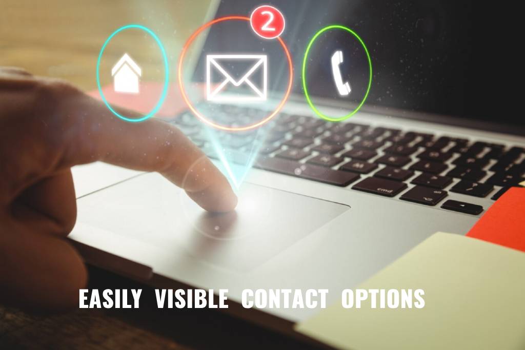
7. Contact Information or Chat Option
A website homepage for better conversions must make it easy for visitors to reach out to you. If a potential customer can’t figure out how to contact you quickly, they’re likely to bounce. Including clear and accessible contact information or offering a live chat option is essential for building trust and facilitating seamless communication. The easier you make it for visitors to contact you, the more likely they are to take action, whether it’s making an inquiry or booking your services.
Why Contact Information and Chat Are Critical for Your Website Homepage for Better Conversions
When users have questions or need assistance, they expect fast and easy ways to get in touch. If they can’t find your contact info or if the process feels like a hassle, they’ll look elsewhere. Including visible, easy-to-find contact options increases trust and ensures users feel comfortable reaching out when they need help. Furthermore, having a chat option provides instant communication, allowing you to resolve any hesitations visitors may have, which can increase your conversion chances.
Must-Haves for Easy Contact:
Phone Number (Clickable on Mobile): Displaying your phone number is a simple but effective way to improve customer trust. Make sure the number is clickable on mobile devices for added convenience. When visitors can call you with just one tap, it improves their overall user experience and encourages more direct contact.
Email or Contact Form: Include an email address or a contact form on your homepage to capture inquiries. A form can streamline the process for users and also protect your email address from spammers. Ensure the form is short and easy to fill out, asking for only the essential information.
Google Map for Physical Location: If you have a physical location, integrating a Google Map on your homepage helps visitors find you easily. This is particularly helpful for local businesses. By displaying your location right on the homepage, you build confidence that you’re a legitimate business, and customers can easily find you if needed.
WhatsApp or Chat Button for Instant Messaging: Real-time communication can significantly increase conversion rates. Adding a WhatsApp or live chat button makes it easy for customers to reach out instantly. This can be especially beneficial for answering questions that could otherwise prevent a visitor from converting, like pricing details or service clarifications.
Want this built-in? Webto.in includes contact and chat forms in every site package.
External Inspiration: Learn more about optimizing your contact section from HubSpot.
8. Trust Signals and Certifications
Trust signals play a critical role in establishing credibility on your website homepage for better conversions. Trust is one of the most significant factors in a visitor’s decision to become a customer, and showcasing trust signals can go a long way in assuring them that you’re a reputable and secure business to engage with.
Why Trust Signals Are Crucial for Your Website Homepage for Better Conversions
When visitors see trust signals like SSL certificates, security badges, or industry certifications, they feel more secure making a purchase or filling out a contact form. Trust signals act as proof that your business is legitimate and committed to protecting customer information. For businesses, incorporating these elements is a powerful way to reduce user friction and boost conversion rates.
Types of Trust Signals You Should Display:
SSL Certificate (HTTPS): An SSL certificate ensures that your website is secure and encrypts sensitive user data, such as credit card information. Having an HTTPS URL is essential for any modern business. It not only improves security but also builds user trust, as visitors are more likely to trust websites with this encryption in place.
Payment Security Badges: Displaying payment security badges, such as PayPal or credit card company logos, reassures visitors that their payment information will be processed safely. These security elements are especially important for e-commerce websites, where transactions are involved.
Industry Memberships or Certifications: If your business is affiliated with any industry organizations or has earned certifications, showcase these prominently on your homepage. This demonstrates your expertise and credibility within your field.
Media Mentions or Client Logos: If you’ve been featured in media outlets or have worked with notable clients, display their logos or mention your media features. This type of social proof builds authority and helps visitors feel more confident in your brand.
Bonus Tip: A section like “As Featured In” or “Trusted By” is a great way to boost authority and provide instant recognition to your visitors. Mentioning established brands or reputable media can significantly enhance your site’s credibility.
External Inspiration: Check out how to integrate trust signals effectively with insights from Neil Patel.
9. Lead Magnet or Newsletter Signup
Not every visitor will convert immediately. For those who aren’t quite ready to make a purchase or sign up for services, offering a lead magnet or a newsletter signup is a great way to stay in touch. A lead magnet can help capture contact details for future marketing efforts, and a newsletter lets you nurture leads over time.
Why a Lead Magnet or Newsletter Signup Can Boost Your Website Homepage for Better Conversions
Having an enticing lead magnet or newsletter signup on your homepage can encourage visitors to provide their contact information. This allows you to build a relationship with potential customers over time, increasing the likelihood of converting them later. By offering something valuable in exchange for their email, you can keep your audience engaged and remind them about your services when they’re ready to take action.
Ideas for Effective Lead Magnets:
Free Checklist: A downloadable checklist related to your business or industry can be a great incentive. For example, if you’re a web design company, offer a checklist on “The Essential Steps for Launching a Website.”
Discount Code: Offering a discount or special deal in exchange for an email address is a proven strategy. It incentivizes visitors to provide their contact details, and if they make a purchase, you’ve achieved a conversion.
Industry Insights or Free Course: Offering valuable content such as industry insights, free courses, or guides can be an excellent way to gather leads. Providing knowledge and value helps position your brand as an expert, making visitors more likely to trust and engage with you in the future.
Placement Tip: Place the lead magnet or newsletter signup section near the bottom of your homepage or even use a slide-in popup to catch attention without disrupting the user experience.
At Webto.in, we use MailerLite and ConvertKit to automate opt-ins, making it easy for businesses to collect leads and grow their email lists.
The footer of your homepage is the last thing visitors will see as they scroll down, so it’s essential to make it useful and informative. A well-structured footer not only provides quick access to key pages but also helps with SEO by adding internal links and improving the overall user experience.
Why a Well-Designed Footer Is Important for Your Website Homepage for Better Conversions
Your footer serves as a secondary navigation menu. It’s a place to remind visitors of important information they might have missed or want easy access to. A clean, well-organized footer not only enhances user experience but also ensures that visitors can easily navigate to crucial areas of your website, potentially increasing your conversion rates.
What to Include in Your Footer:
Quick Links to All Major Pages: Include links to your most important pages like your services, blog, about page, and contact page. This helps users find what they need without scrolling back to the top of the page.
Social Media Icons: Display icons that link to your social media profiles. This encourages visitors to connect with your brand on multiple platforms, increasing engagement and brand visibility.
Privacy Policy / Terms: Make sure your footer includes links to your privacy policy, terms of service, and other legal disclaimers. This builds trust and ensures you’re compliant with data protection laws.
Copyright Info: Displaying a copyright notice helps with brand credibility and shows that your website is professionally managed.
Newsletter or Contact Link: Including a link to your newsletter or contact page in the footer ensures users can always reach out if they have questions or want to stay updated.
A well-structured footer is not just a last-minute thought — it plays a key role in improving both UX and SEO, making it an important component of a website homepage for better conversions.
External Inspiration: Explore footer design tips from Smashing Magazine.
Why Your Website Homepage Matters for Better Conversions
Your homepage isn’t just a welcome mat — it’s your top salesperson. With a strategic layout, clear messaging, and essential conversion elements, you can turn visitors into leads or customers quickly.
Need help optimizing or building your homepage from scratch? Get in touch with Webto.in — we specialize in small business websites that don’t just look great but also perform.